InkTank
I designed a tattoo mobile application called InkTank as a project assignment for my UX Design course.
Tools: Balsamiq, Figma, Optimal Workshop, Usability Hub
Overview
Purpose: Design a new tattoo app for UX design course
Objective: Explore inspiration for tattoo designs according to preferences like artist and style.
Role: UX/UI design
Duration: Sept 2019 - Feb 2020
Problems and Goals
In order to create a useful and intuitive tattoo app, I looked through a few of the most popular tattoo apps and read their reviews and conducted 3 initial user interviews. I wanted to determine how other people were looking for and organizing their tattoo inspiration and what their experiences were.
Competitive Analysis
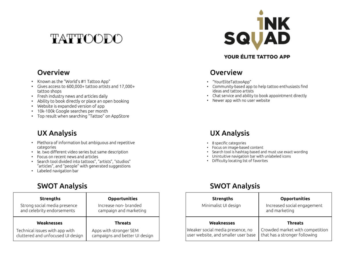
The most popular existing tattoo apps have certain user pain points, such as overwhelming interfaces (Tattoodo) or difficult search tools (InkSquad).
Most of those I interviewed relied on Instagram or Pinterest to search for tattoo inspiration. While these are great tools for browsing photos, it’s difficult to filter for a certain style or artist location so users have to use multiple apps to search for inspiration and then find a tattoo artist near them.
What I Discovered
People were easily overwhelmed when looking for a perfect tattoo and tattoo artist. Some people had no idea where to start, while others knew what design or style they wanted but didn’t know which tattoo artist to go to. They found it difficult to search for or filter out tattoo styles, and most wanted some type of consultation.
Problem Statement
Users need a convenient and personalized way to browse tattoo designs and the portfolios of nearby tattoo artists, with the ability to reach out for consultation/feedback in order to get their perfect tattoo.
User Personas
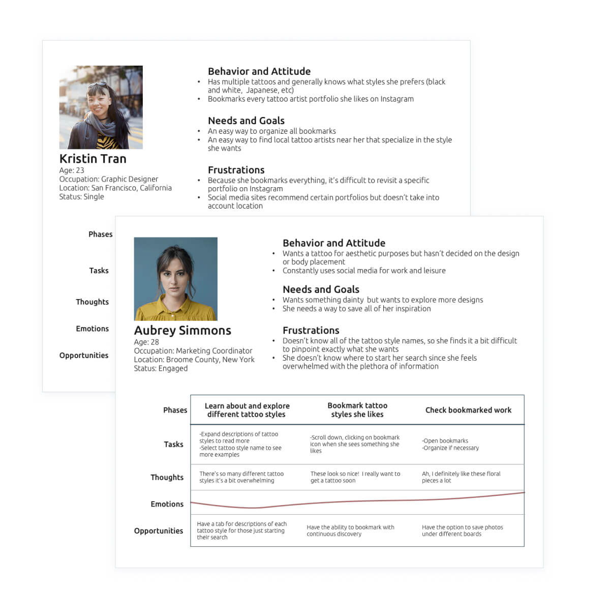
I created user personas to help organize different user demographics: the tattoo noob, the tattoo enthusiast, and the tattoo artist. Defining their behaviors, needs, and frustrations helped pinpoint how they would approach and navigate a tattoo app.
UX Design
At this point, I knew the main functions must include an explore screen, the ability to bookmark tattoo inspiration and easily go back to those photos, and the ability to message tattoo artists.
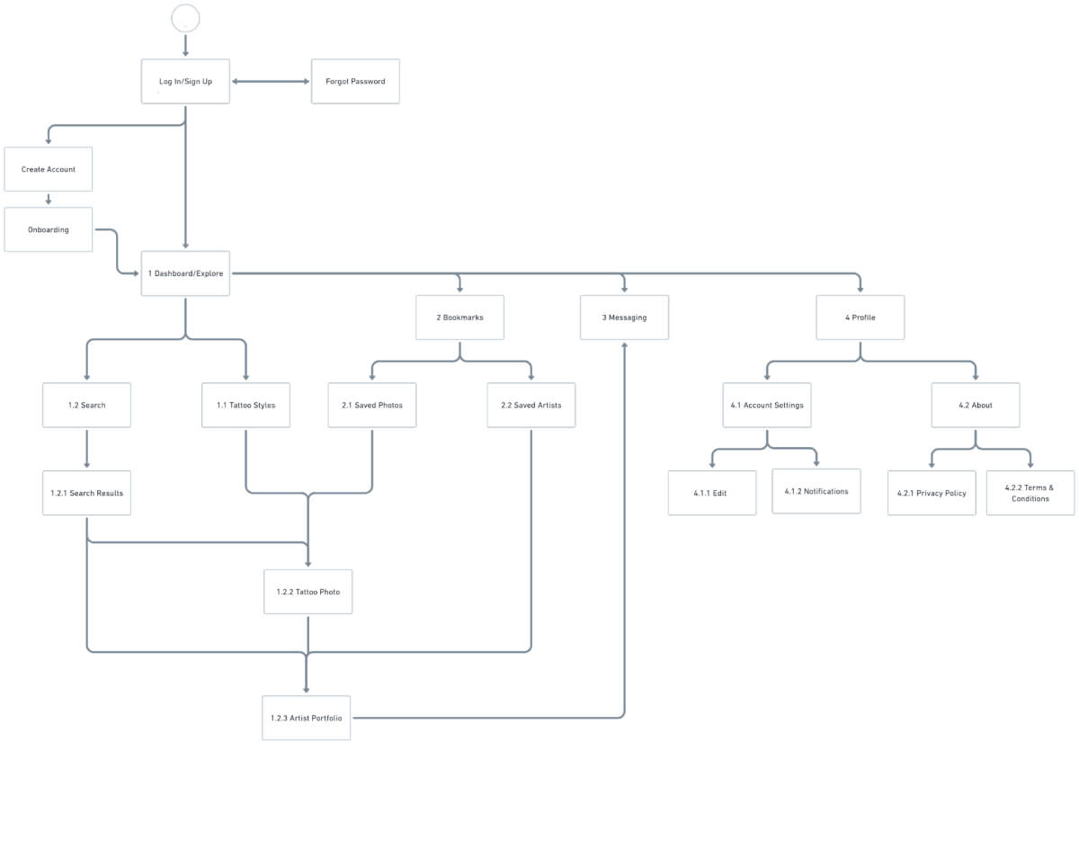
I created a site map to work out the basic layout for the mobile application and started sketching out some low fidelity wireframes.
Lo-Fi and Mid-Fi Prototypes
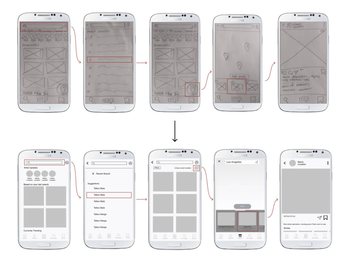
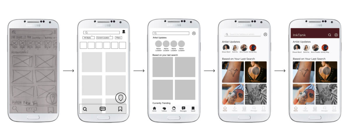
I started off trying to make the interface and navigation as simple as possible, therefore choosing to draw the first wireframes with only 3 main selections and tried to fit all searching/exploring of tattoos and artists on an “Explore” page.
After showing the prototype to a few potential users, I realized how much information the dashboard would have to include. Dividing the information into different screens would be more intuitive and help simplify it. Splitting the “Explore” page into “Home”, “Tattoos”, and “Artists” would be more relevant to different users, depending on if they were simply browsing or if they were seriously looking for a tattoo artist in their area to book an appointment.
Usability Testing and Feedback
I conducted 6 moderated usability tests on my mid-fidelity prototype to
- Measure the learnability and intuitiveness of navigating the mobile application for first-time users
- Determine what features need onboarding
- Get general feedback on the usability, design, and structure of the application
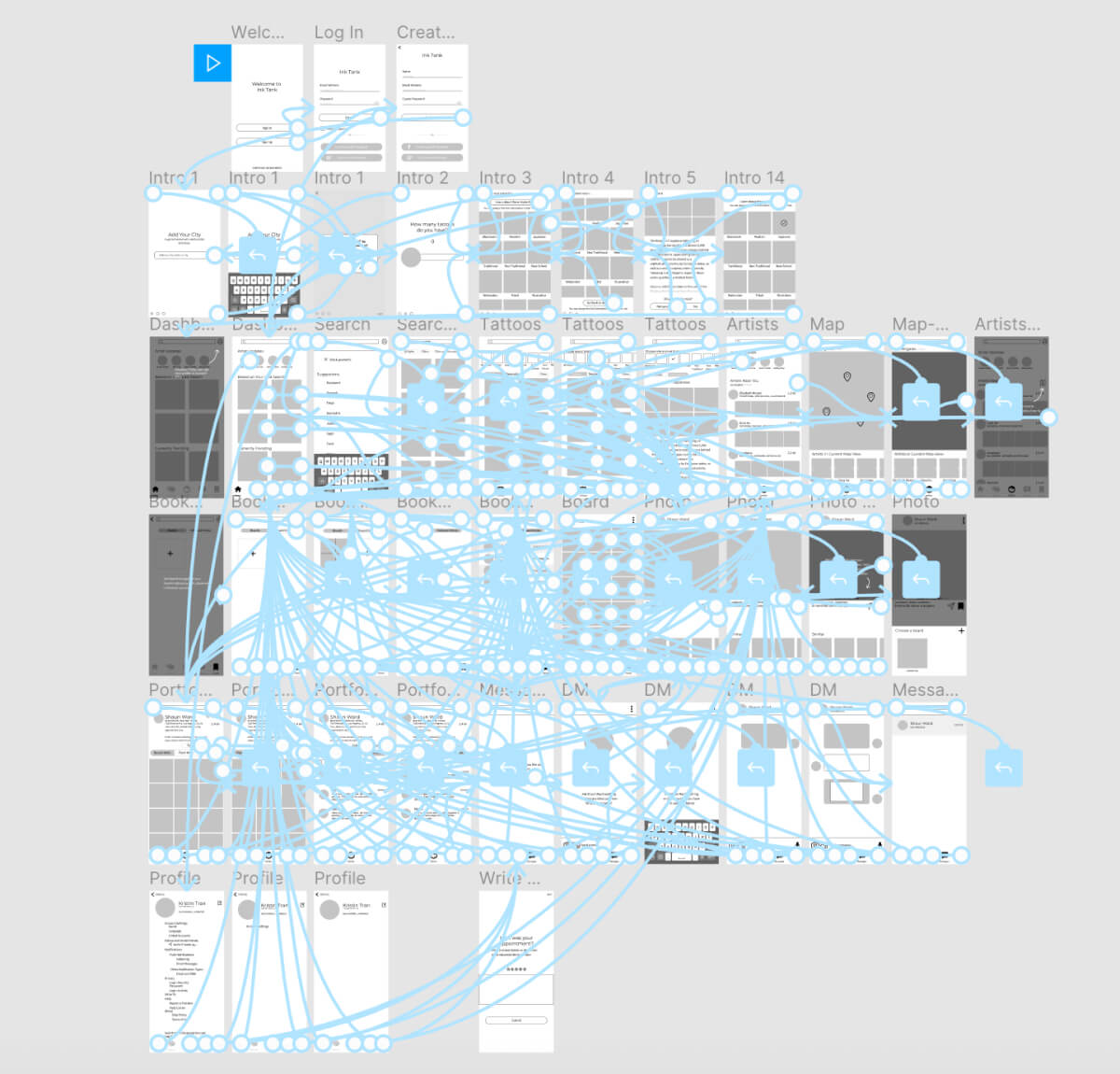
I asked users to complete certain tasks during the testing process:
- Sign In/Create an Account: Determine if the process is smooth and users can easily sign in or create a new account
- Onboarding: Determine if the current onboarding process is effective or if additional/less onboarding is necessary
- Explore and Browse the App: Determine is navigation is intuitive and users can easily explore new categories or find what they are specifically looking for
- Message an Artist: Determine if users can easily find a tattoo artist and message them for personalizing a tattoo design or booking a session
Usability Report
-
Issue 1: Users had difficulty selecting certain buttons (high severity)
Change: Increase touch spaces following guidelines suggested by Material Design (48 x 48dp with 8dp of space in between)
-
Issue 2: Headings were too close to “back” icons, creating some confusion (medium severity)
Change: Center headings while keeping the back button left-aligned
-
Issue 3: Onboarding screens regarding personalization was overwhelming (medium severity)
Change: Change the layout to incorporate tabs or horizontal scrolling, so each tattoo style is displayed separately
-
Issue 4: Interface seemed unappealing/not mature (low severity)
Change: Change navigation bar icons in favor of more minimalist/mature icons suitable for target market (age range of 18-40)
Polishing the Design
After fixing the discovered usability issues, I focused on creating a high-fidelity wireframe and prototype. I utilized UsabilityHub for preference testing and gathered feedback from my CareerFoundry mentor and fellow students. I also reviewed the WCAG to make sure the app would be accessible.
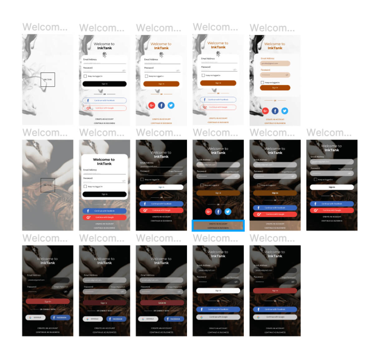
Rapid iterations for the login screen. I conducted 3 preference tests to narrow the choices down and was surprised by the results.
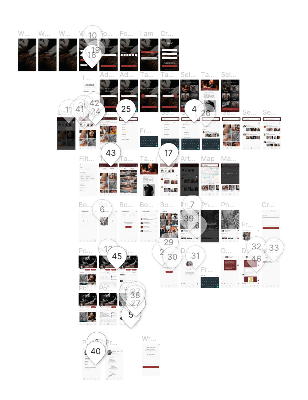
Feedback from CareerFoundry students meant extra eyes looking at my project.
Specific Examples
Search Bar
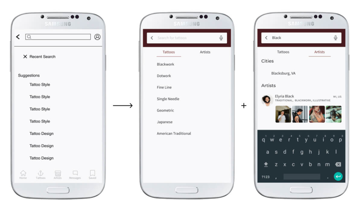
The initial search bar was meant as a master search bar of sorts, where you could type any tattoo or artist name and a bunch of suggestions would be generated. However, users might not realize they can also search for a specific artist or city, and coding this massive search tool could be a huge headache for developers. Categorizing their searches by tattoos and artists would allow users to find what they were looking for much more quickly.
Personalized Dashboard
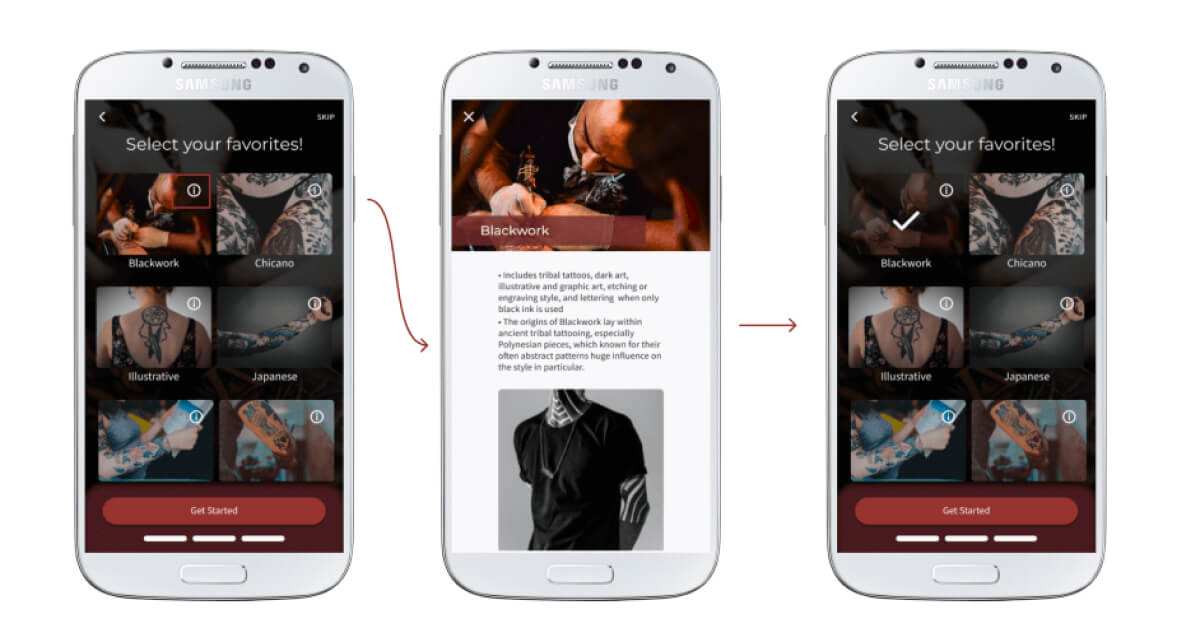
Since tattoos are so personal, I wanted the tattoo app to have a personal feel to it. However, my initial screens asking users to select their favorite tattoo styles didn’t seem intuitive, and many participants of my usability test either spent more time deciphering the screen or completely skipped the step where they could learn more about a tattoo style. I was told the screen was overwhelming, most likely due to not having enough white space.
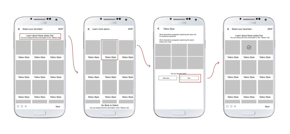
I adjusted the flow and was able to eliminate a screen. In addition, the current iteration has a bit more breathing room, with larger images and more negative space in between rows. The informational overlay feels less cluttered and gives space to show photos one-by-one.
Overall Process
I went over each screen with the same approach and asking the same questions:
- Which features are actually crucial?
- Is there a way to simplify this screen?
- Does the visual hierarchy make sense?
- How would (persona name) want to interact with this page?
I experimented a lot with my designs and constantly asked for feedback on my reiterations. I had a few mentor calls where we just focused on the UI and I bugged my sister and a few friends about more major changes. I ran a couple of preference tests for my sign-in screen, conducted usability tests, and individually messaged fellow students through Slack to check out my prototype.
The data I collected from user research helped make the prototype much more intuitive. My overall design now has larger images and fonts while gaining more white space, making it easier to scan through and simplifying the UI.
Current Prototype
Future Iterations
One participant of my usability test asked about a tattoo FAQ’s page, where common questions about pain levels and hygiene issues could be answered. I chose not to include this page due to the nature of these questions: everyone’s pain tolerance is different, and each tattoo artist should be giving instructions on how to care for their clients’ fresh ink. However, I do realize that people usually search for this information on Google or through friends, and might want an expert opinion or be able to refer back to the care instructions. I could conduct a few interviews to determine if adding this section would be a feature people are interested in. If so, I would also conduct card sorting to see where users expected this information to be found.
Takeaways
I learned a lot from working on this project, from spending time with my mentor discussing pros and cons of design choices for each screen, to being reminded from testing that I should never assume my opinions and assumptions will reflect the general user. I'm also thankful that i was able to add more tools to my toolbox.